In 2025, your website is often the very first interaction someone has with your business. It’s your handshake, your storefront, and your first impression—all rolled into one. And with people browsing from every kind of device imaginable, from smartphones and tablets to laptops and smart TVs, one thing is clear: your website needs to work everywhere.
That’s where responsive design comes in. And if your site still isn’t responsive, it’s not just outdated—it’s costing you visitors, leads, and trust.
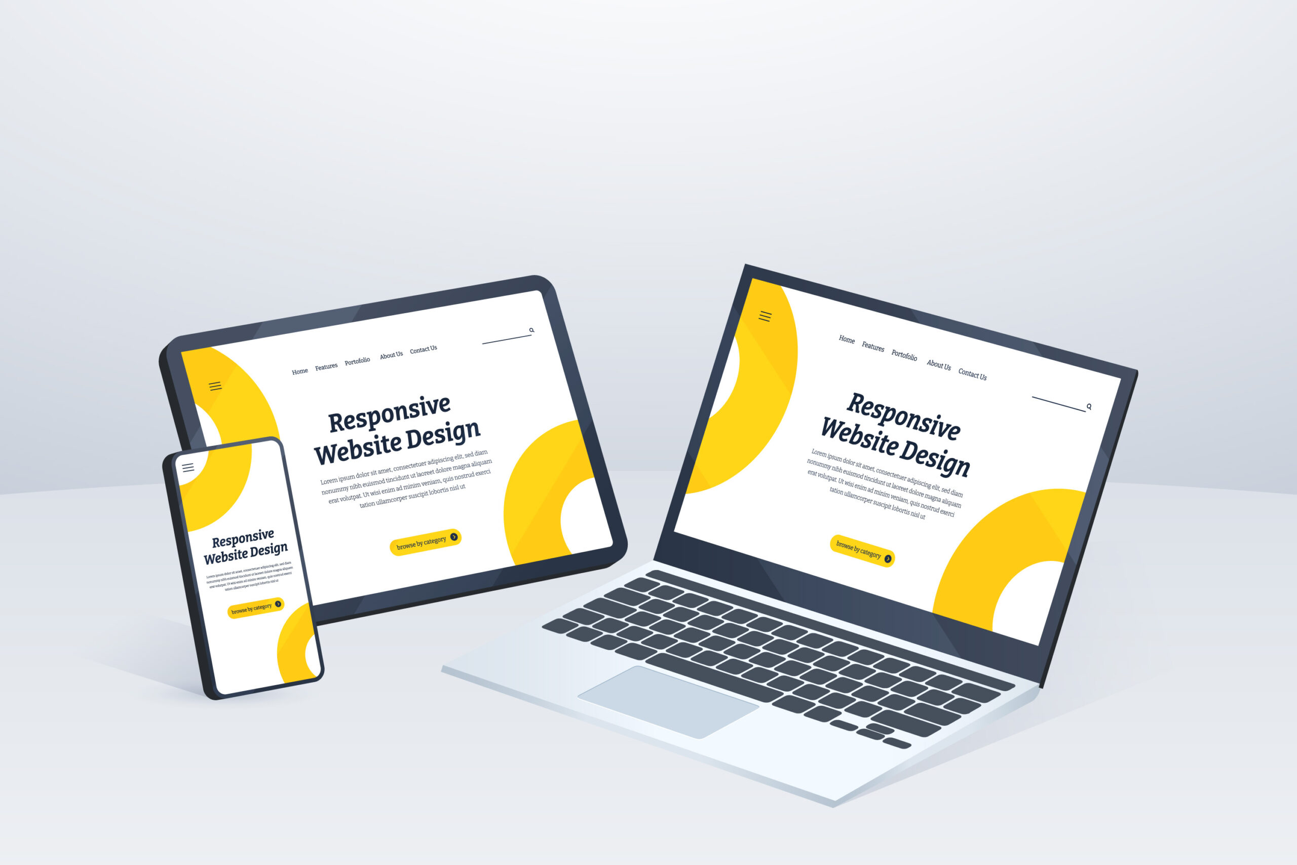
What Exactly Is a Responsive Website?
A responsive website automatically adjusts to the size and shape of the screen it’s being viewed on. Whether someone visits your site on a phone while riding the subway or on a desktop at their office, the content should be just as readable, functional, and easy to navigate.
There’s no pinching or zooming. No broken layouts or disappearing menus. Just a clean, user-friendly experience every time.
Why It Matters More Than Ever in 2025
Mobile Traffic Isn’t Optional—It’s the Norm
Most people browse the internet on their phones. If your site doesn’t load properly or look good on mobile, many users won’t even stick around long enough to find out what you offer. You only get a few seconds to make that first impression—don’t waste it on a broken layout.
Google Cares About Mobile First
Google’s search engine now uses your mobile site as the starting point when determining how you rank. That means your mobile version isn’t the backup—it’s the main act. If it doesn’t meet modern usability standards, your visibility in search results will take a hit.
People Expect Seamless Experiences
User expectations have changed. People expect fast-loading, intuitive, easy-to-use websites on every device. If yours feels clunky or confusing, they’ll leave. Worse, they might not come back.
New Devices Are Constantly Emerging
Technology is evolving quickly. Foldable phones, wearable screens, smart TVs—your audience is visiting from all kinds of devices. A responsive design means you’re future-proofing your website for whatever comes next.
What’s at Stake?
Imagine this: someone clicks on your ad or Google result. They land on your site… but the text is too small to read, the images are misaligned, and they can’t even find the menu. Chances are, they’ll close the tab in seconds and look elsewhere.
Now imagine the opposite. They land on a site that loads quickly, fits their screen perfectly, and makes it easy to find what they need. That’s the kind of experience that builds trust and keeps people coming back.
What You Can Do Right Now
- If you’re not sure whether your site is responsive, here are a few things you can do:
- Visit your website on your phone and tablet. Does it look and function properly?
- Use free tools like Google’s Mobile-Friendly Test to get a quick assessment.
- Talk to a developer or agency that specializes in responsive design. (Agencies like Probey Services do this every day.)
- Prioritize simple navigation, fast loading times, and legible text. These basics matter more than flashy designs.
Final Thoughts
Having a responsive website in 2025 isn’t just about keeping up—it’s about staying in the game. Your website is more than a digital business card; it’s a critical part of how people find you, trust you, and choose to work with you.
If your site doesn’t work well on every screen, you’re putting up a barrier between your brand and your audience. The good news? A responsive site doesn’t just improve user experience—it helps your rankings, your credibility, and your bottom line.


